Posts Tagged ‘infovis’
Saturday, February 20th, 2016
The report The digital divide in the city of Barcelona describes Barcelonans ICT access, use, and the quality of their use. It was put out by the Mobile World Capital Foundation at the request of the Barcelona City Hall, in an effort to detect disparities between districts.
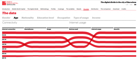
Factors such as age, education, income level and employment impact the way information and knowledge are accessed, giving rise to what has been called the “digital divide.” Specifically, the digital divide refers to the inequality between those who have access to knowledge via new technologies, and those without it. (more…)
Tags: 300000kms, Barcelona, brecha digital, d3js, digital divide, escletxa digital, infovis, MWC
Posted in dataviz, maps, software | No Comments »
Friday, August 10th, 2012
 I was always a big fan of Ring Charts, also known as Multi-level Pie Charts or Radial Treemap, specially the Baobap disk allocation program for Linux, developed by Igalia. Now I want to start to use them for other kind of visualizations as an alternative to treemaps. I didn’t find any implementation in Javascript so I started to develop one on my own using Processing and it’s Processing.js exporter. The design of the classes was inspired by this Java Ring Chart implementation.
Some characteristics of this class: It’s size and the thickness of the rings adapt dynamically to the container. The rings can start and end at any angle. The segments of each ring are divided proportionally based on the segments value and drawn to the proper arc length based on the start and end angle.
You can download the sources at OpenProcessing, what follows is a description of the classes ArcSegment, Ring and RingChart.
(more…)
Tags: infovis, javascript, Multi-level Pie Chart, processing.js, processing.org, radial treemap, ring chart, rings chart
Posted in software | No Comments »
Wednesday, October 5th, 2011

Last year I developed a graph visualization for my colleges from YProductions. Since then they used it for their projects of mapping cultural agents in different cities like Alicante and Murcia.
Now we published the sources of the flex project on Github under GPLv3 license. The code is written in Actionscript3 based on flare library. Data is read from an external GraphML file so if you want to publish your own graph just create an XML file based on your own data.
You can find more information on the wiki.
Tags: flare, FLOSS, github, GPL, graph, infovis, redada, YProducciones
Posted in software | No Comments »
Monday, May 10th, 2010
 Durante los últimos tres meses estuve trabajando para votainteligente, una ONG que busca informar a la ciudadanía y fomentar la accountability sobre los políticos chilenos. Estuve desarrollando una aplicación de monitoreo parlamentario que explica y valora las actividades de los diputados y senadores.
Tags: chile, Fundación Ciudadano Inteligente, infovis, opendata, protovis, symfony, transparencia, votainteligente
Posted in software, webdesign | No Comments »
Tuesday, April 20th, 2010
Art Numerica junto con el Centro Cultural de España organizan estos días un taller de Visualización de Datos. El taller busca introducir a los paricipantes en las estrategias de visualizaciones dinámicas, mezclando investigación, manejo de datos, comunicación y programación. Se dará especial énfasis a proyectos que indaguen en temáticas relacionadas con datos públicos, cultura libre, sistemas de información alimentados colectivamente, captura de datos de fuentes públicas, etc.
Aquí esta el wiki con los recursos del taller y aquí el blog que ha creado Jacob para que nos comuniquemos los avances en cada proyecto.
Tags: chile, infovis, javascript, mapping, processing.org, workshop
Posted in education | No Comments »
Friday, March 5th, 2010
Una semana pasó desde el terrible terremoto en Chile y seguimos con replicas. La siguiente gráfica muestra la cantidad y magnitud de todos los terremotos en Chile desde aquel 27 de febrero 2010.

Aquí esta la versión interactiva (hecho con Protovis), mueve el ratón sobre los círculos y verás hora, lugar y magnitud de cada uno de los más de 200 replicas con magnitudes entre 4.9 y 6.9 según la escala de Richter.
Tags: chile, infovis, protovis
Posted in software | 2 Comments »
Tuesday, February 2nd, 2010
 After using prefuse library and Processing for graph visualization a new project gave me the chance to try flare, the translation of prefuse to Actionscript.
My colleges from YProductions are investigating who are the principal persons, collectives and institutions in Alicante cultural live. The project is called redada and I made a social graph (lightweight version) of their results of investigation. First impressions: Good API design and quite stable for a alpha release.
There are still some improvements to be made in my application but if you want to make your own experiments you can start with this basic example, download Flex Project here.
Tags: flare, graph, infovis, redada, YProducciones
Posted in software, webdesign | 4 Comments »
Sunday, January 24th, 2010
Un argumento que escuché muchas veces cuando me trataron de explicar el porque del voto obligatorio en Chile es el deber del ciudadano de participar en la democracia y la ventaja de una alta participación. Mirando en detalle los números de las recientes elecciones presidenciales veo que la participación real (basada en los adultos con más que 18 años) era un 59%, resultado similar a otros cálculos. De los más que 12 millones de Chilenos con más que 18 años hay casi 4 millones que no están inscritos y otro millón inscrita que no votó.
Si Chile sigue con el sistema electoral actual basado en inscripción voluntaria, voto obligatorio y prohibición del voto desde el extranjero, dentro de dos elecciones la participación rozará los 50%. Puedes bajarte esta hoja de cálculos para ver todos los números en detalle.
(more…)
Tags: chile, infovis
Posted in news | No Comments »